
Flickr’s new (May 2013) user interface: “tight ass”?

Did ya see Flickr’s new UI?
Some users rejoice, some blogs tout its updated design merits, and designer/developers like me run to see what they’ve done to bring it up to date.
At first glance…
It’s pretty. It’s full-screen, image-centric, responsive, and their catchy homepage incorporates some nice parallax movement (since I can never remember my pre-Cenozoic-era Yahoo user login, I initially did not see the logged-in view.)
So…I wanted to see some photos of a location (Bodie, which this Google images search {favoritism much?} will show as an epic ghost town!), so I clicked in the search box from the homepage and hit submit.
Houston…we’ve lost our stylesheet.
Yeah, so this happened. (Note: rearrange the 3rd word’s letters for different/relevant meaning.)

Yahoo has really embraced the negative space. And take a closer look at those body classes!
Ok, it happens. Crap? Yes…that too. But dev bugs as well. This was visible as an un-styled search results page in both Firefox and Chrome. It’s surprising to see the folly, given they launched it with much publicity across media/blogs…
So I dug around…
Maybe a stylesheet failed to load? Maybe the CDN took a “this” {again, rearrange the letters}? Or maybe they launched the new UI and figured “Bah! No one uses that search box, which is so big and juicy and prominent in the header. Fuggedaboutit…just launch.”
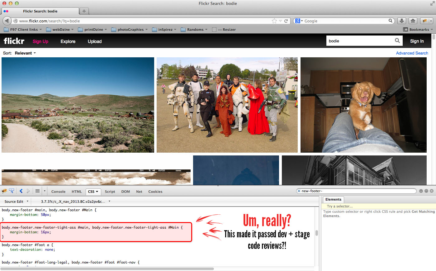
In looking at code, I notice some classes applied to the body element. (They’re great, and highly useful when we do our own WordPress-based web development.) But there’s a peculiar class called “new-footer-tight-ass”.
Um, really?
Yes, really. Stop being a tight ass and look at the picture.
Flickr’s tight ass UI get appropriate classes.
Of note, they fixed the un-styled search results page and the styles began appearing like they should. But the funny/terrible class name is not only a body class, it also has rules applied to it.
I’m all for having fun with development…
…but seriously folks, when Yahoo!/Flickr launches a new UI, you know developers will flock to the site to check it out and inspect under the hood.
- Did “ass” mean something short for “assembly”?
- Is it because I wasn’t logged in, so presumably I’m a freeloading “tight ass” penny pincher using the site?
- Am I being too hard on them?
On this last point, I say no. UX design and development is a weighty responsibility, and how your client (or your company) is represented by your under-the-hood work is important.
So I tried to log in
Who knows, if the penny-pinching angle is right; maybe after logging in the “tight ass” class would go away. I’d have to search (read: archeologically dig for) my Yahoo login, but it would be worth a shot.

Popup window + horizontal scollbar = the devil’s progeny
So I clicked “sign in” at the top right…to be greeted by a popup. Not a desirable user experience, but also not horrible. From a development perspective Flickr/Yahoo have their domain and http vs https reasons – I get it.
But the popup window…why can’t it be bigger to accommodate everything?! It’s simple to address, and consequently poor form to have the easily-fixable, wonky user experience.
Logged in – yet still a tight ass
No change to the body class after logging in. So I guess they’re not dissing me for lack of payment.
It’s not the end of the world to have the word “ass” in your CSS/HTML, but surprising. It seems like code review would have relegated this to a quick laugh, then a change. As Steve Jobs’s dad noted, you need to paint the back of the fence. Taking care of what is not visible (or is, in this case) is important for quality work.
Aside from the class-name blunder,
here’s to hoping Marissa Mayer will help Yahoo!’s product offering, and their UX across the ecosystem as well. The Tumblr acquisition must have been done with good reason – let’s just hope the Yahoo! won’t demolish the community.
FWIW – this tight ass thinks the new UI is lovely. :)

Comment by Shuaon May 22, 2013
Nice catch Mike. It really peeves me when developers belittle the art.

Comment by Kennyon May 22, 2013
Nice catch, man! I’ve seen classes like “ie-sucks”, and that is fine because, well, it does. :d But to classify (literally) non-paid users as tight-ass is an unfortunate insight to large corporate cultural attitudes toward their users. And it’s worth noting that these tight-ass users are bathing in ads that probably net a higher profit to Yahoo than paid (loose-ass?) users do. So, in other words, nice way to treat your customers, Yahoo. Seriously, wow…

Comment by Mike Leeon May 23, 2013
Ha – nice, Kenny. But to be sure, the class didn’t change after I logged in, so it may be that they’re not dissing me as Captain PennyPincher. Still not sure why the class name was there, though. Just someone thinking a 16px margin makes a footer “tight-ass”, I guess (that’s the only CSS rule I can see applied based on that class).